Part 2: Wireframes with Relume
How I Redesigned My Portfolio in 15 Days

In Part One, we set the stage for a portfolio refresh designed to stand out in the current job market. After deciding on Webflow as the foundation and planning out my project's scope, it's time to get into the fun bits. In Part Two we focus on the hands-on process, working with Webflow and Relume, turning my plans into polished, responsive wireframes that are ready for design.
Relume
With Webflow as my foundation, I ran into a problem that a lot of non-designers hit: making sure that the website is responsive, meaning it adapts smoothly to different screen sizes, from desktops to smartphones. While I have a background in content strategy and some UX (user experience), translating that into a responsive design wasn't going to be easy. This is where Relume came in; think of it as a collection of pre-built Webflow components. Each piece is coded to adapt to different screen sizes, saving me from learning and implementing responsive design principles.
Relume's value for a strategist like me or someone like you? It cuts through the complexity. This meant I could drag, drop, and customize without thinking about how it would look on a tablet or phone—it just works. This took a bulk of the work out of the equation.
Working with Relume felt natural. I laid out the Sitemap first. A sitemap is essentially a diagram that defines the structure of your website, mapping out all the pages and how they interlink. Once the sitemap was in place, I moved to wireframes. This is where I selected the specific Relume components that would best serve each page's purpose. Wireframes offer a visual guide to where elements like text, images, and CTAs (Call to Actions) will go, albeit in a simplified form.
Here, we want to picture the user journey through the site, making sure that every click brings them closer to the information or action they seek. It's a crucial step in making sure your website is user friendly.
Step 1: Sitemap
My sitemap was going to be direct and functional. The homepage is where most of the information will be housed, created for two types of visitors: my peers in creative strategy looking for a someone like me to join their team and potential freelance clients. They're looking for the quick facts—my expertise, what I've done, and a slice of personality.
Starting with a Nav Bar, there's a concise intro about me. Then, a section for selected works—just teasers to catch interest. After that, a rundown of the tools I work with, because those competencies matter in my field. Next, my resume section, briefly showcasing my professional milestones. The AI and automation segment is deliberately placed further down. It’s a cool feature, but it's not the headliner—my work is. I want visitors to see it as a value-add, not a gimmick. The process section follows, laying out how I approach strategy, leading to a call-to-action for potential collaboration. An FAQ section to inject some of my character into the site, rounding off with a standard footer.
There’s also a 'Works' page, offering a deeper dive into my projects, and individual 'Project' pages for detailed case studies.
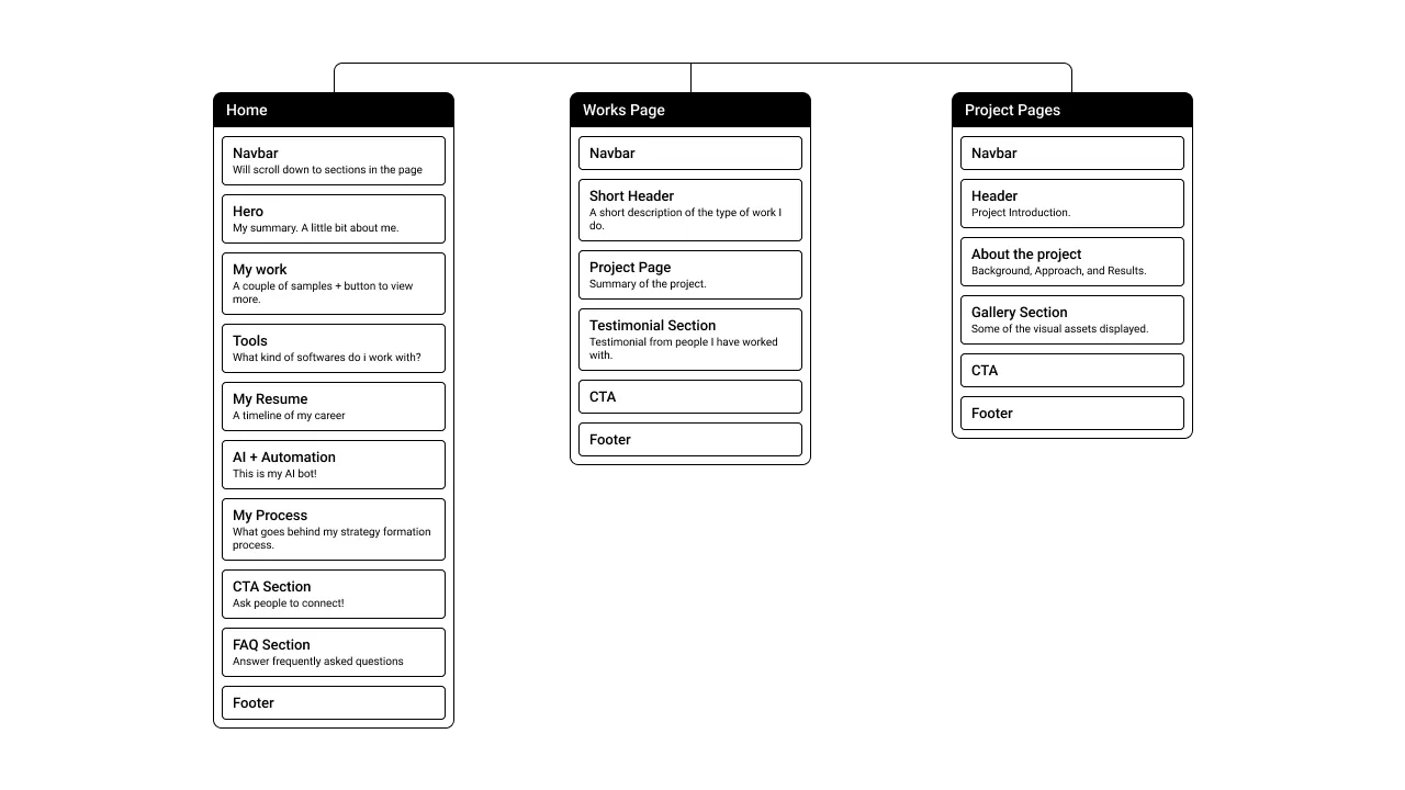
Here's the visual layout of my sitemap, structured in Relume, which will give you a clearer picture of the website's architecture.
Step 2: Wireframes
Next up, wireframes. Here is where Relume really lets you get creative. Like I said, they offer a comprehensive library of components, alas not free. However, it gives you the flexibility of going through various layouts to come up with the one that works best for your use-case.
Let's take my portfolio as an example.
For the Navigation Bar, I aimed for functionality and ease of use. Something simple, designed to guide users through the various pages. As for the Hero Section, the goal was to immediately present a snapshot of who I am—a visual introduction with my photo to the left and a brief summary to the right, showcasing my identity at a glance.
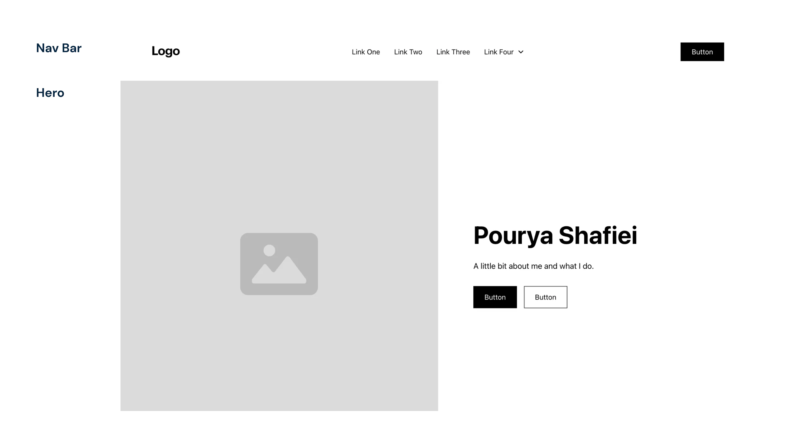
First impressions matter. That's why the hero section of a website isn't just about aesthetics; it's about immediately communicating your identity and value proposition.
In the My Work section, I wanted to feature two projects. I wanted a design that included descriptive tags for a quick overview, with the functionality to click through for more details. I included a 'View More' button to lead visitors straight to the extended works page for more of my portfolio.
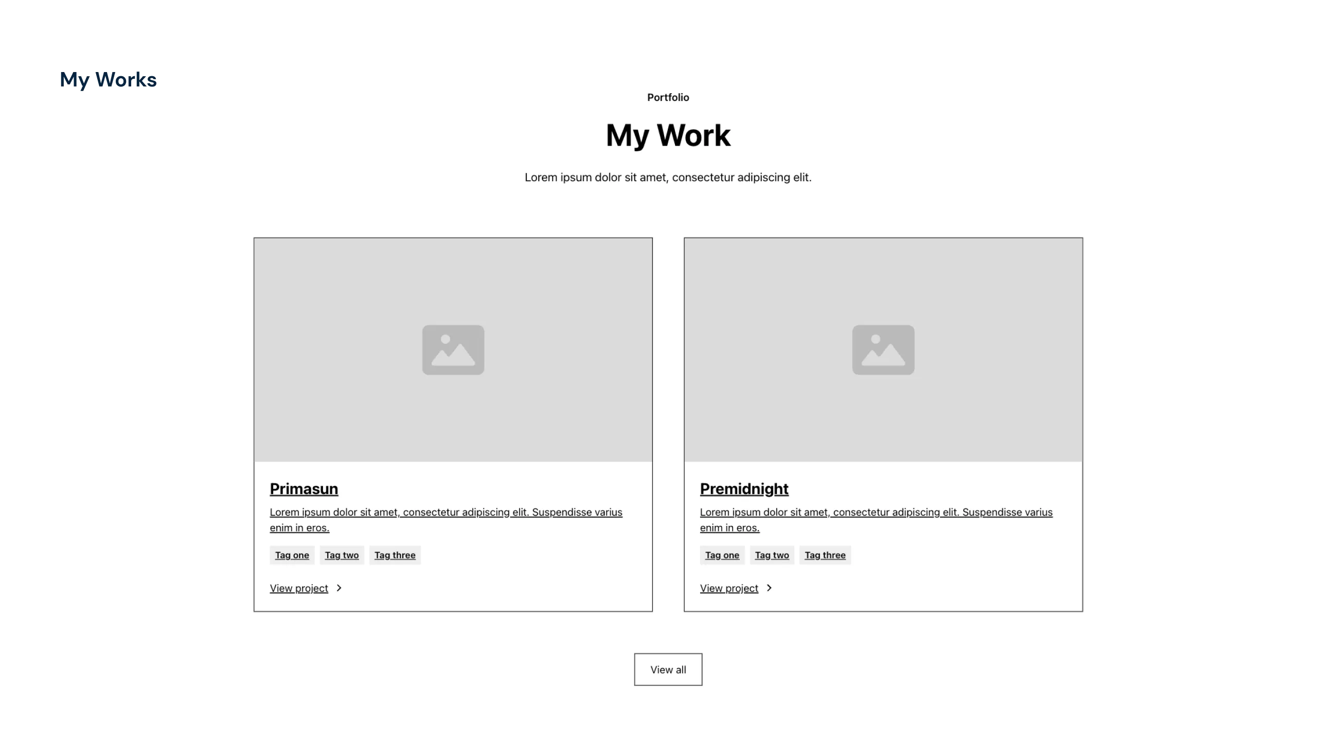
Show, don't just tell. Use imagery and tags to provide a snapshot of your projects, offering a user-friendly experience that invites deeper exploration.
For the Resume section, I wanted something that was intuitive and engaging, featuring logos and a brief timeline of my roles. The below format would allow me to display details of the duration, my position, and my contributions. A layout that's straightforward yet interactive.
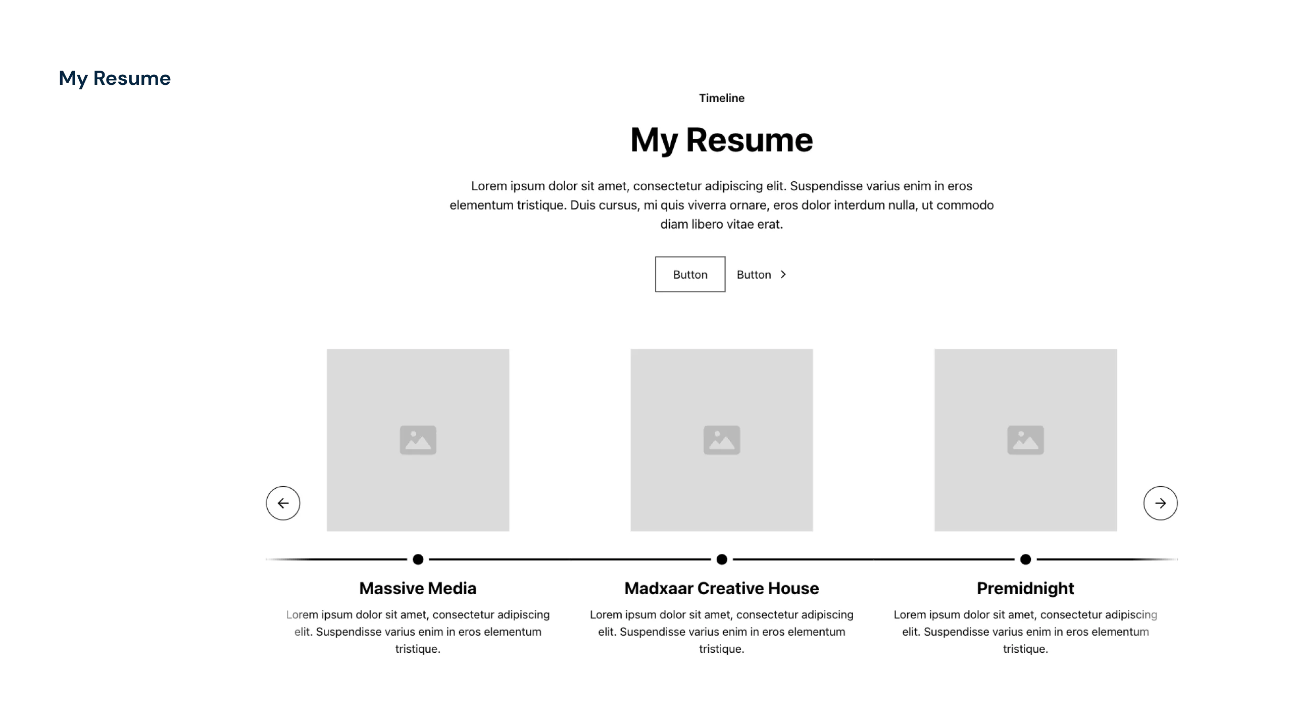
Displaying just three roles at once keeps the timeline focused and digestible, highlighting key experiences without overwhelming anyone.
So far everything was pretty standard but when it came to the AI Section, I needed a chat module but Relume doesn’t have a chat module, and nothing in the Webflow Templates fit the bill. So, I got creative and set up a form for users to submit their questions. It’s a simple solution that I tweaked within Webflow to match my requirements (I’ll go into detail on this in the fourth part).
For the Call-to-Action (CTA), I kept it simple: a secondary colour that draws the eye. Consistency is key, so this CTA style will be duplicated across the website and tied back to a main CTA button in the Nav Bar.
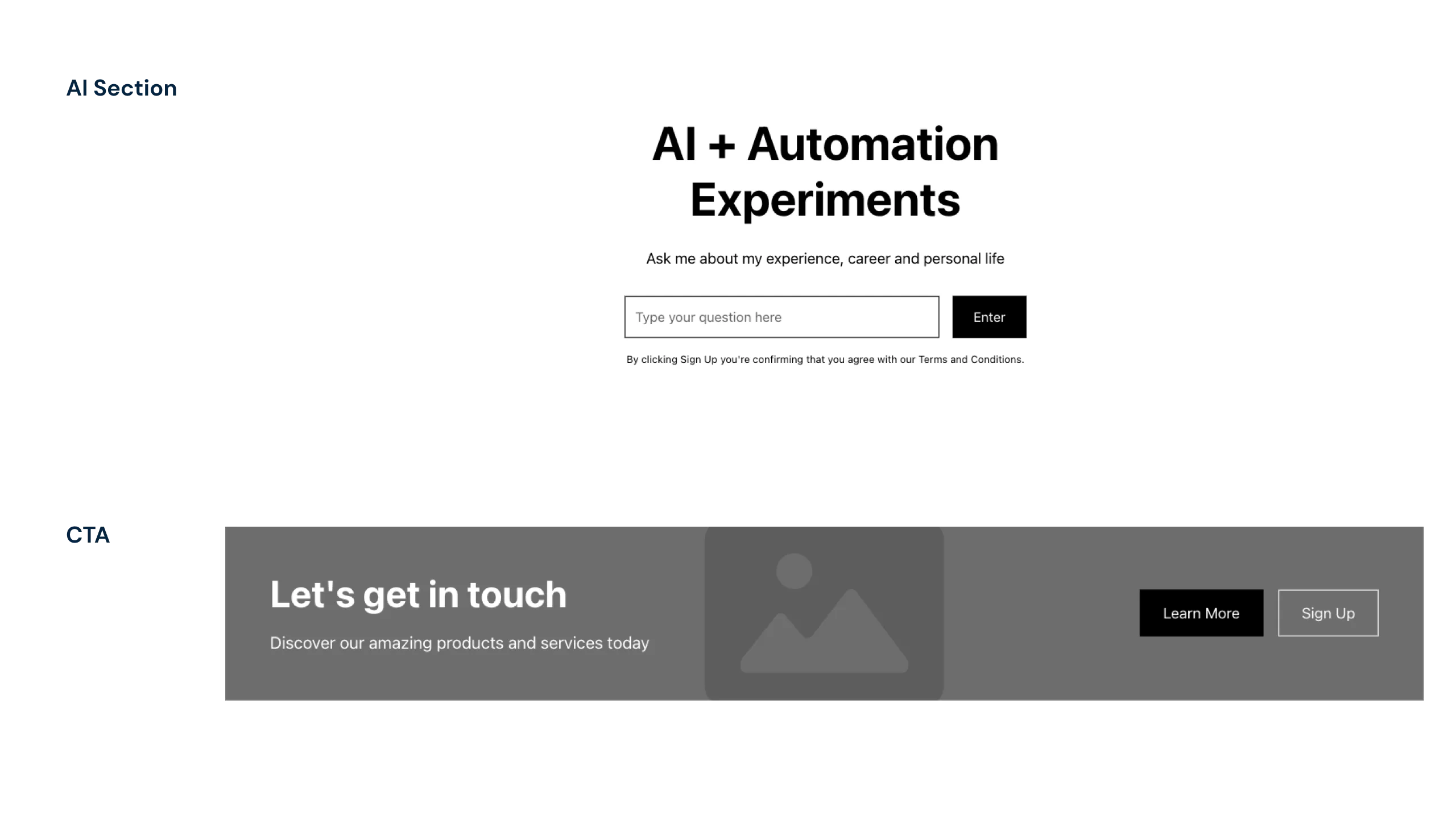
When pre-made templates didn't fit the bill, stitching together components became the solution to creating a custom module that fit my needs.
For the FAQ Section, I chose a minimalist approach, which Relume facilitates beautifully. It offered expandable modules that keep the design neat. If visitors have a question, they click, and the answer expands right in front of them.

The FAQs aim to connect, providing a snapshot of my professional insights along with a bit of personal trivia to give a picture of who I am beyond the strategist.
For the Footer, the goal was simplicity. We aren't reinventing the wheel. It's a place where visitors can find the quick info: contact details, social media links, and navigational cues to the rest of the site.
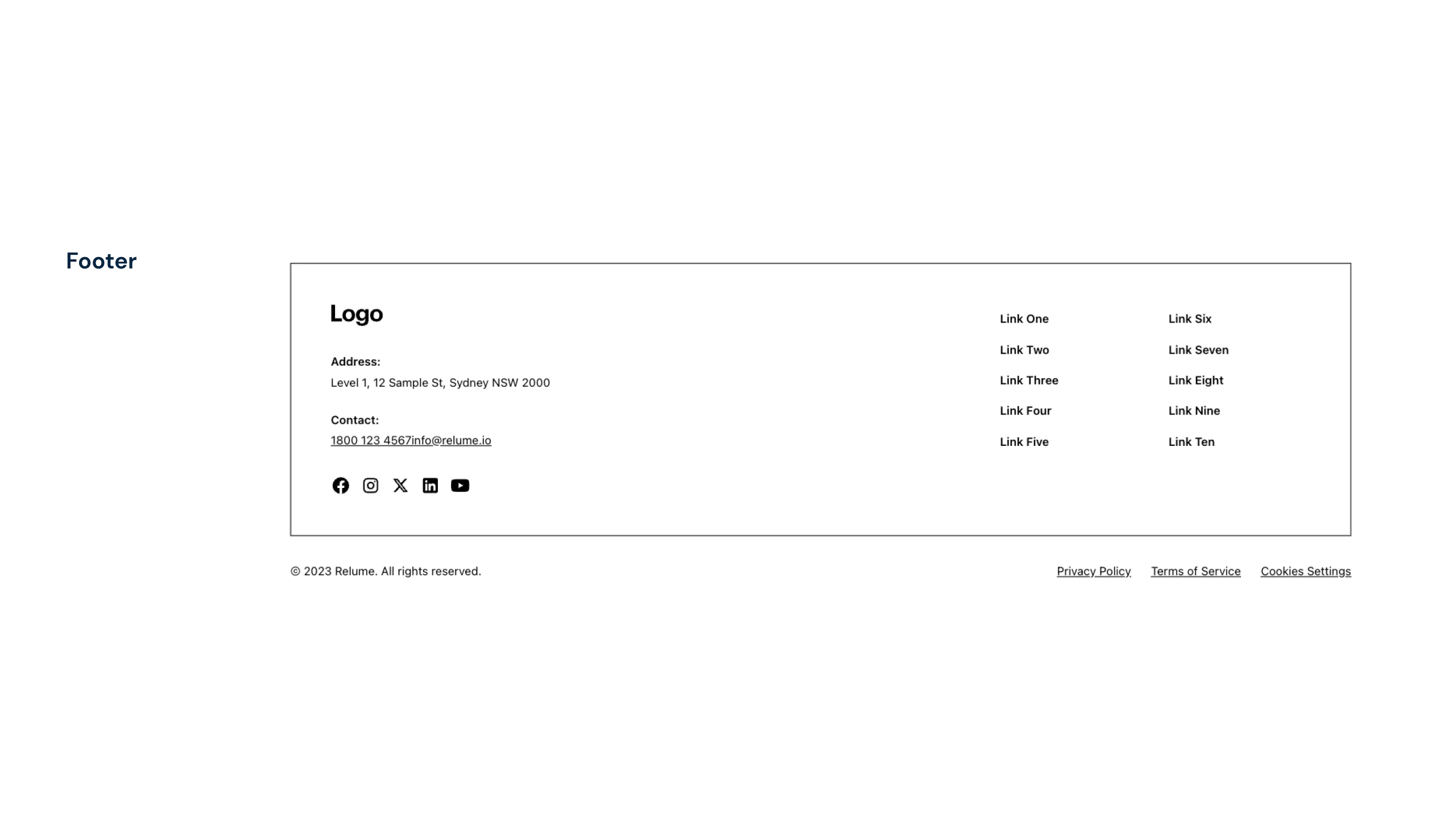
A well-designed footer anchors the website, offering users the necessary signposts for next steps and keeping information within reach.
Step 3: Copy to Webflow
Wrapping up the wireframing phase, Relume really streamlined my workflow. Once the components were selected, it allowed me to export the entire page setup directly into Webflow or Figma. Copying from Relume and pasting into Webflow meant I hit the ground running with a responsive design skeleton tailored to my project's needs.
And just a quick note—Relume isn't paying me. My excitement comes from an appreciation for how much smoother Relume made the design process. That said, it’s worth noting that they have since launched an AI powered sitemap builder, simplifying the process even further. (It's worth checking out if you're into that sort of streamlined efficiency in web design.)
Now, having laid the groundwork with Relume, the next step is to dive into the nitty-gritty of design within Webflow. Follow me to see how the wireframes evolve into a fully fleshed-out, interactive experience. And yes, we will also be getting into how ChatGPT and make.com come together to bring the AI component of the site to life.
Sky's the Limit.
Ready to elevate your brand? Launch a campaign? Redo your website? Or discuss the art of making the perfect espresso? Let's chat.
